Deneb in Power BI
In one of my projects, we needed a visualization that the built-in Power BI charts could not adequately support. The goal was to create a complex Gantt chart that simultaneously displays the current status of projects, their timeline, expected completion dates, and a planned vs. actual comparison.
The complexity was further increased by the need for a multi-level hierarchy (Epic – Feature – User Story) and the visualization of milestones. Neither the built-in nor the downloadable custom visuals handled this properly, and Python-based solutions required compromises (particularly in terms of interactivity). This is how I ultimately arrived at Deneb.
What is Deneb?
Lorem ipsum dolor sit amet, Deneb is a certified custom visual for Power BI. It allows you to define Vega or Vega-Lite specifications in JSON format, and Deneb renders the visualization based on those specifications. For me, its biggest advantage was the significant increase in visual control, while Power BI’s interactivity (filters, cross-highlighting) remains fully intact.consectetur adipiscing elit. Ut elit tellus, luctus nec ullamcorper mattis, pulvinar dapibus leo.
Vega-Lite or Vega? When should you use which?
- Vega-Lite: More declarative; ideal for quick prototypes and “standard” charts that can be easily extended with custom elements (layer, transform, tooltip).
- Vega: Lower-level, offering detailed layout and interaction control (scales, axes, marks, signals) — particularly useful for complex, Gantt-like scenarios.
- Practical approach: Start with Vega-Lite and only move down to Vega if the visual or interaction requirements demand it.
Quick comparison
Solution | Advantage | Disadvantage |
Power BI built-in | Fast, maintainable, widely known | Limited customization, complex Gantt/hierarchy is difficult |
Custom visual | Many ready-made solutions | Flexibility quickly runs out for unique requirements |
Python vizualisation | High flexibility | Limited interactivity, more difficult report integration, Python knowledge |
Deneb (Vega/Vega-Lite) | Full control + interactivity within Power BI | Learning curve, coding/JSON editing required |
Vega-Lite Basics in Brief
Typical building blocks of a Vega-Lite specification:
- Schema: The specification version (e.g., Vega-Lite v5).
- Data: The data source (static values or a Power BI dataset).
- Mark: The type of visual elements (bar, point, line, etc.).
- Encoding: Axes, color, size, tooltip, and other mappings.
- Optional: transform (calculated fields), layer (composition), selection (interaction), etc.
Vega-Lite Example – Planned vs. Actual Comparison
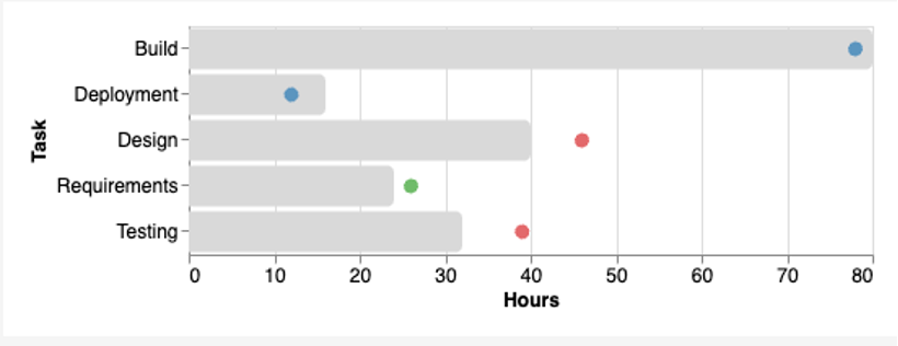
In the example below, we display planned and actual effort for a task list. The bar represents the planned_h value, the point represents the actual_h value, and conditional coloring is applied based on status.
After reviewing the code, it becomes relatively clear what each part is responsible for:
- Data: This is where we define the data. If implemented in Power BI using its data model, this section will only contain “dataset”. The fields you drag into the visual’s field well in Power BI will populate that dataset.
- Transform: Here we can perform additional calculations on the existing data. In this case, it defines the calculation of delta_h.
- Layer: With layer, we stack the bar and point marks on top of each other.
- Mark: This is where we define the Bar and Point marks — specifying the x and y axes, data types, sorting logic, titles, tooltips, and other visual properties.
- Width, height, config: Finally, we can set the dimensions of the visualization and define the base configuration settings.
Vega Basics in Brief
In Vega, we explicitly define the scales, axes, and visual elements (marks). Interactivity is often added using signals (e.g., hover, click, brush).
Vega Example
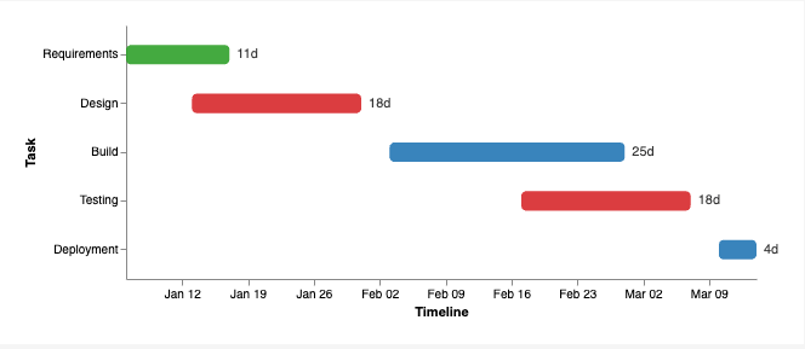
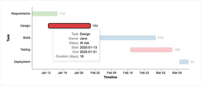
The example below is a simple timeline/Gantt-like view: rect bars represent each task’s start–end interval, the status determines the bar color, hovering highlights the selected row, and the duration (in days) is displayed as a label.
As you can see, the Vega code is more complex. You need to define every scale in the “scales” section, and “axes” is also a separate section where you define the axes. The “marks” section contains the visual elements (e.g., rect, symbol, line, text), each with states such as “enter”, “update”, “hover”, etc. This makes Vega highly flexible and allows very detailed control.
Summary
Deneb is especially powerful when you need to “step outside the box” while staying within Power BI: you can build complex yet interactive visuals using Vega-Lite or Vega. Vega-Lite enables fast iteration, while Vega becomes the better choice when you need fine-grained layout or interaction control.